Harper’s Bazaar
We developed our online version of the famous Harper’s Bazaar Magazine
Process
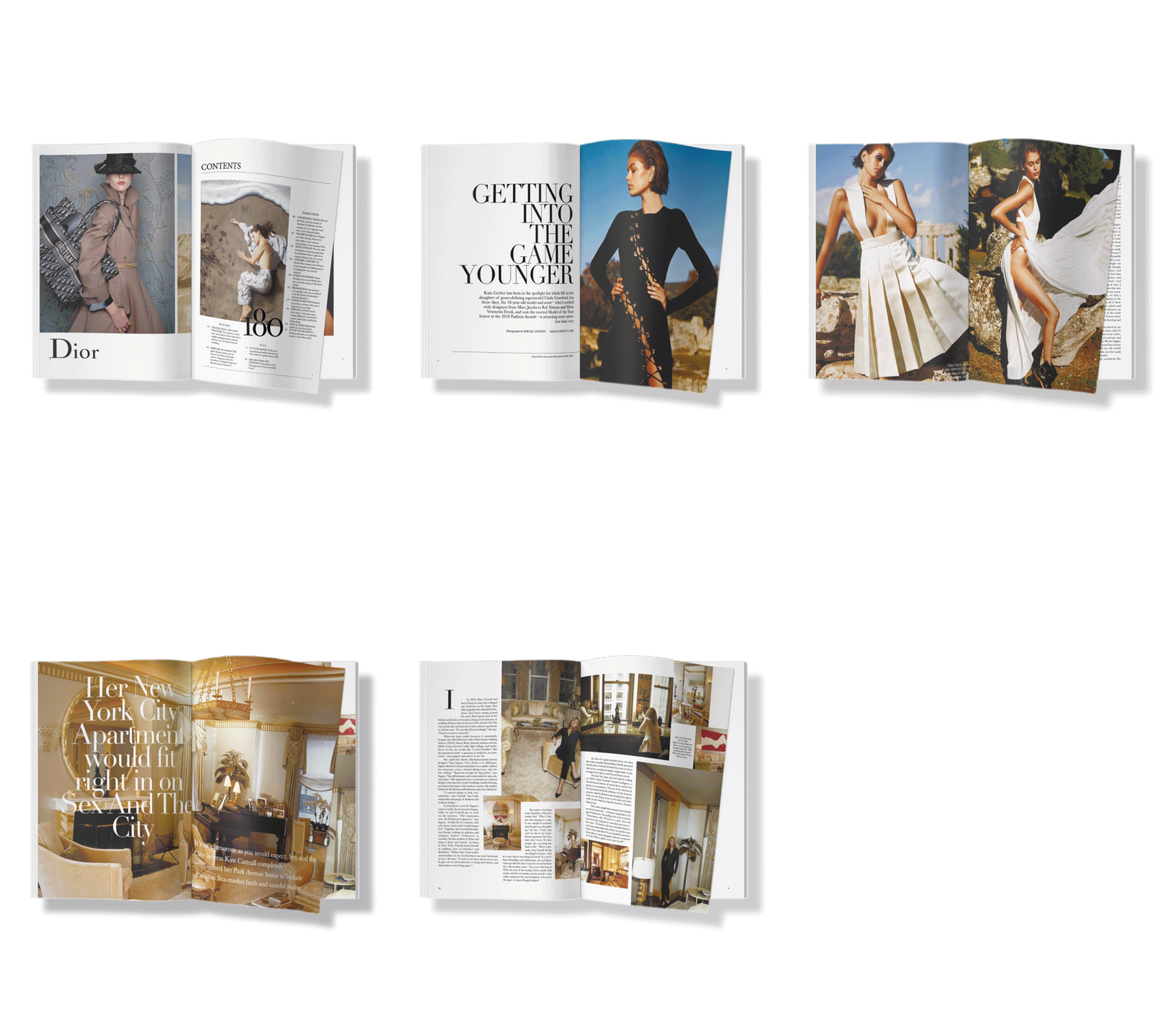
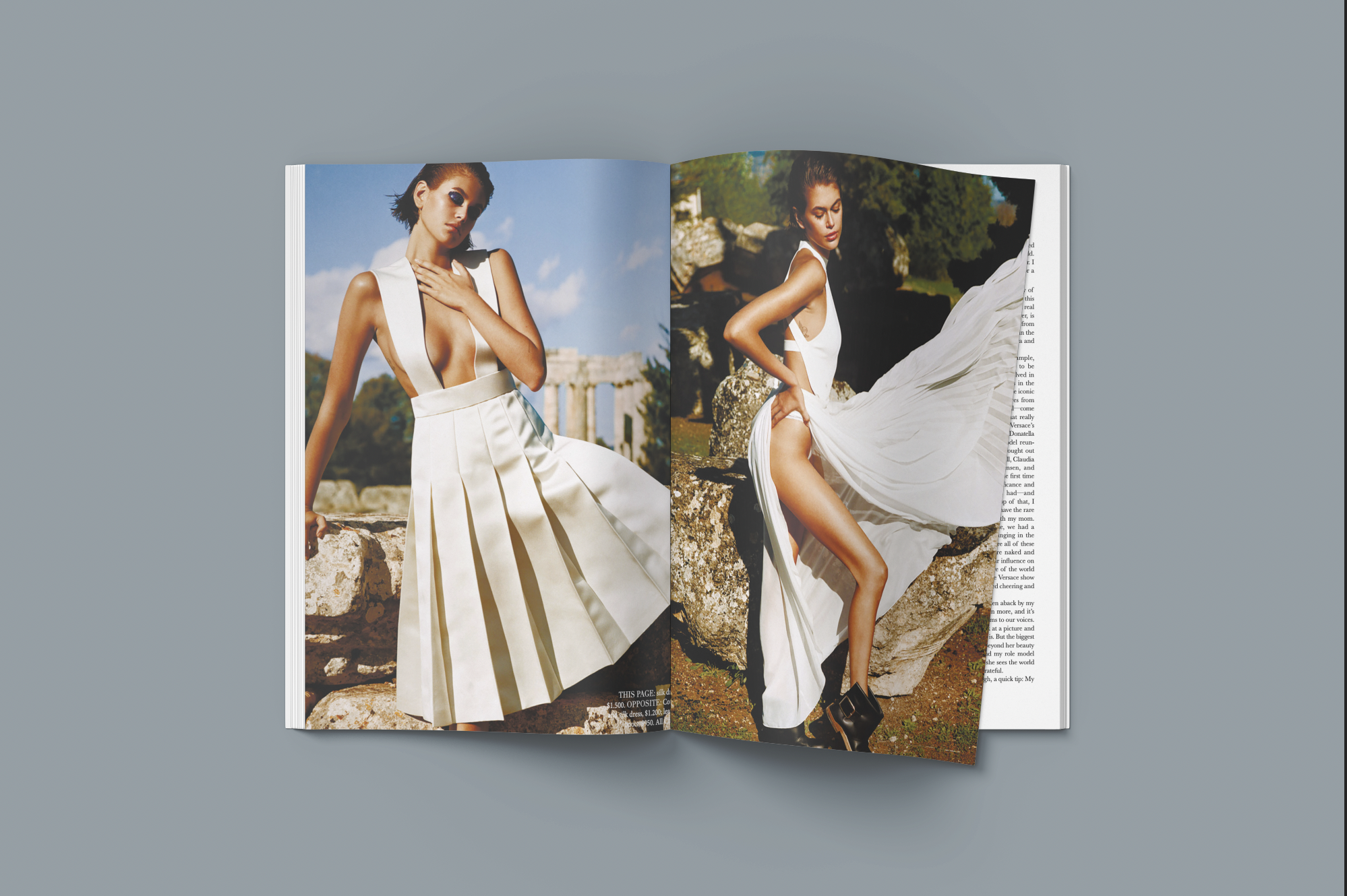
Our main focus while designing Harper's Bazaar was to create a visually stunning and sophisticated fashion magazine. We aimed to maintain the aesthetic appeal of the print version for our digital readers. Within a month, Up Digital produced three engaging stories - about model Kaia Berger (who also graced the magazine's cover), the iconic apartment of actress Kim Cattrall, and the history of the fashion brand Gucci. Our priorities included choosing the right font, illustrations, and photography to achieve the desired visual impact.

Magazine Cover Design
Our approach to redesigning Harper's Bazaar was guided by two key requirements: simplicity and uniqueness. We aimed to create a design that would stand out from the competition. To achieve these, we began by exploring unique layouts and innovative ways to showcase visual content and text, while also incorporating the distinctive elements of the Bazaar brand into the digital format.
Table of Content
In our redesign of Harper's Bazaar, we created a table of contents and used a photo of Bella Hadid wearing Bvlgari accessories as its centerpiece. This helped to provide a clear overview of the magazine's contents and establish a visually appealing introduction to the reader. The photo of Bella Hadid also effectively showcased the magazine's focus on high-end fashion and accessories, setting the tone for the rest of the publication.
Copywriting for Magazine Stories
In our redesign of Harper's Bazaar, we selected photography that was both elegant and simple, aligning with the magazine's brand identity. The aim was to attract and engage readers by showcasing the latest fashion, health, and design trends. The tone of voice was a crucial element in attracting and retaining readers, making the content enjoyable and memorable.


